The Bird & The Churchkey | Logo design | Illustration
The Bird & The Churchkey is one of the very few gin bars in Copenhagen. To stand out from the crowd, we looked into tweaking their logo and spicing up the general visuals.
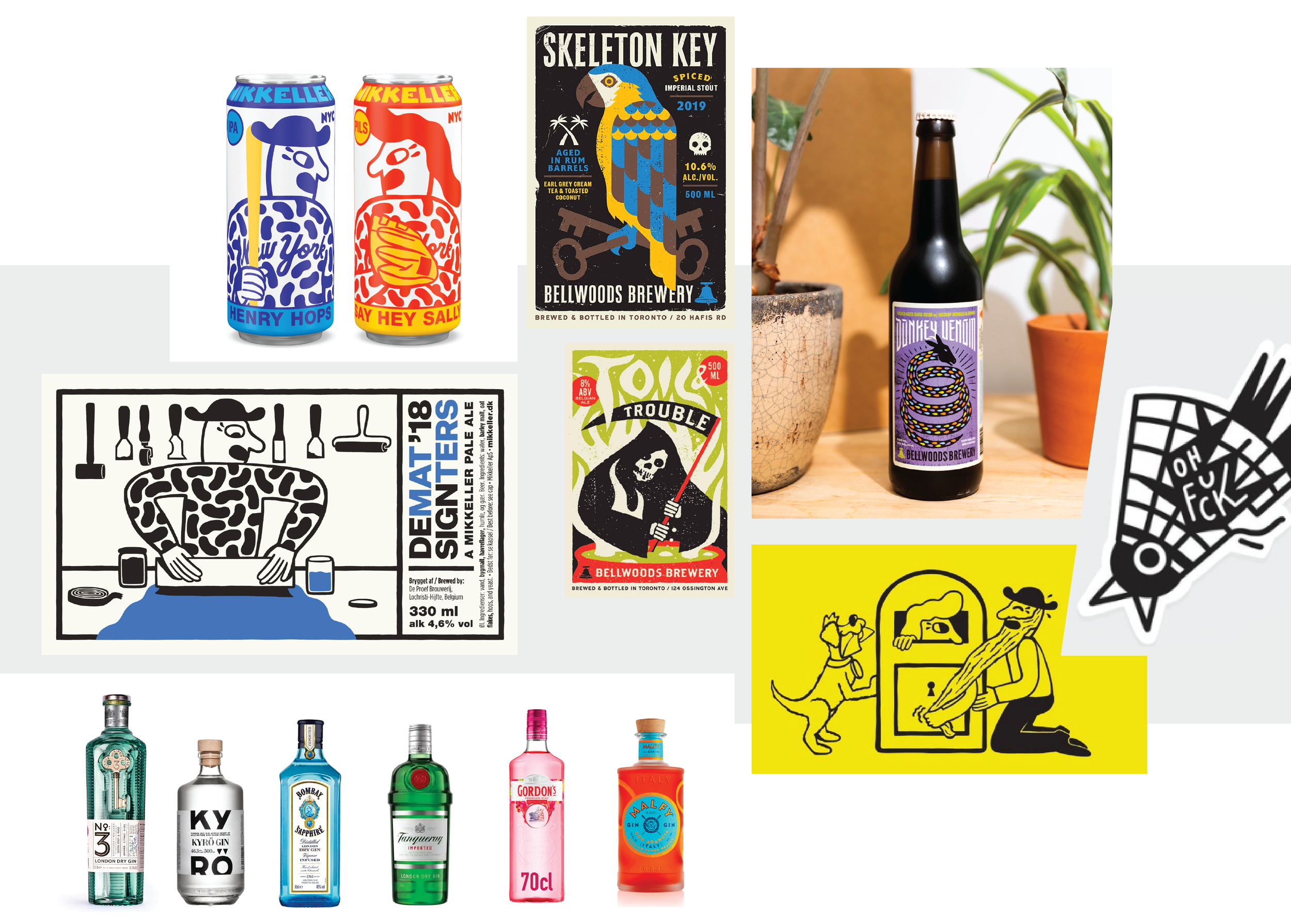
fun
edgy
direct
colorful
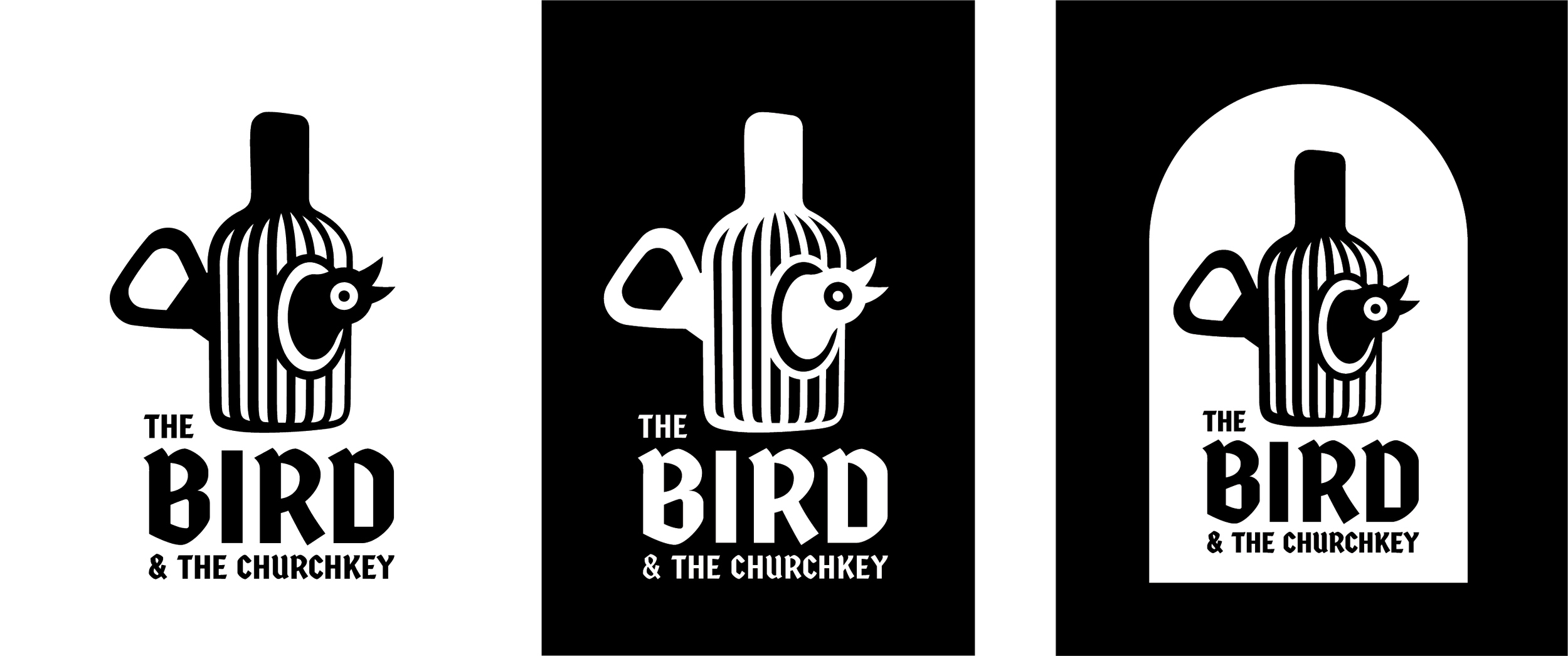
The logo combines the key elements from its name – ‘The Bird’ and ‘The Churchkey’.
It encapsulates the idea of a happy bird being kept in a gin bottle. What better place to be than that?
Accompanied by a modernised twist of a traditional typography, it creates an image of a brand that is aware of the best kept gin traditions.
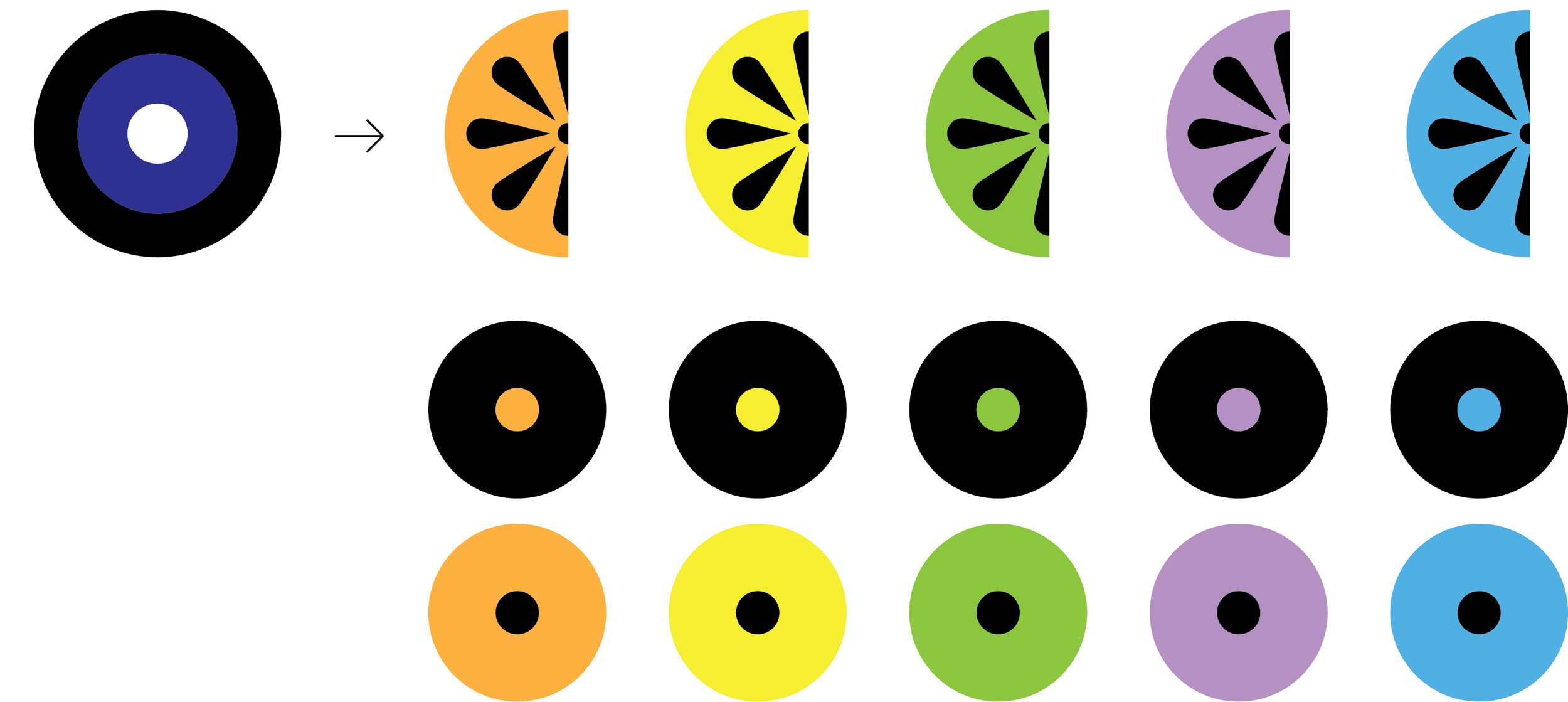
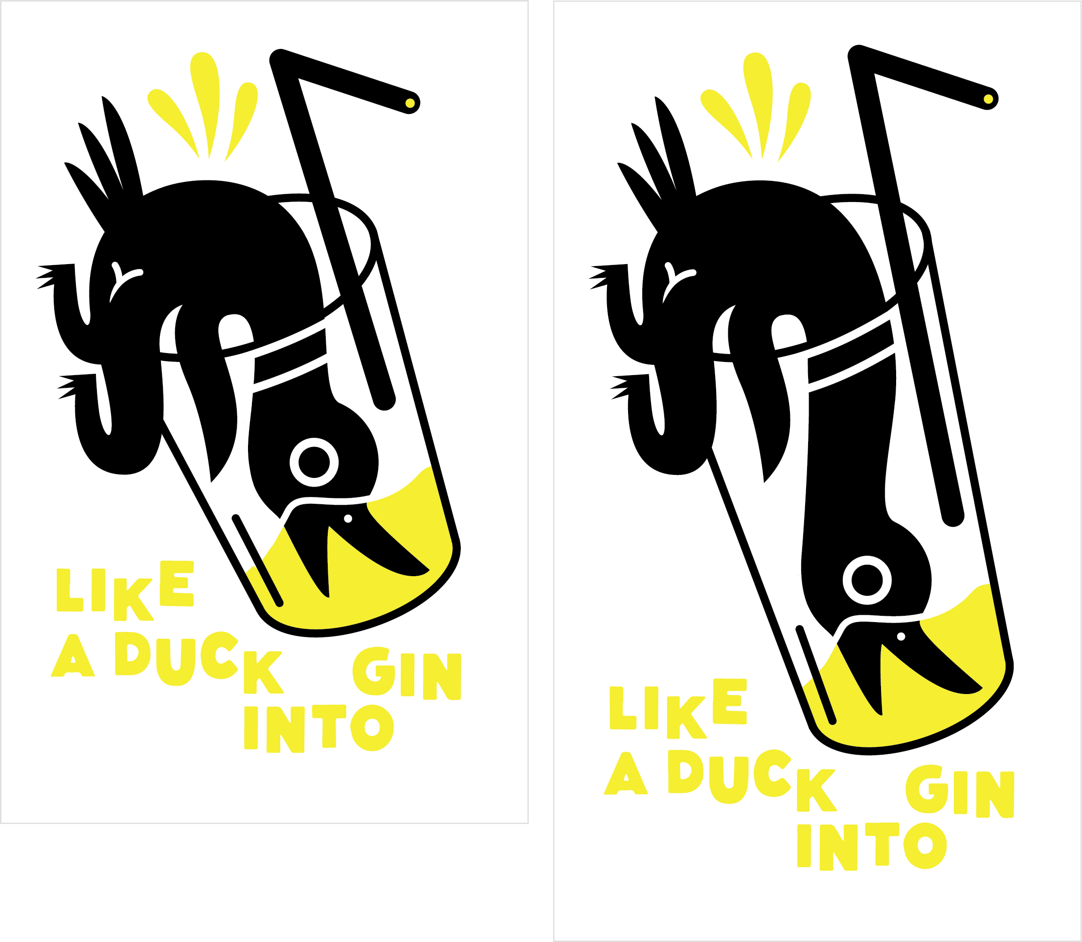
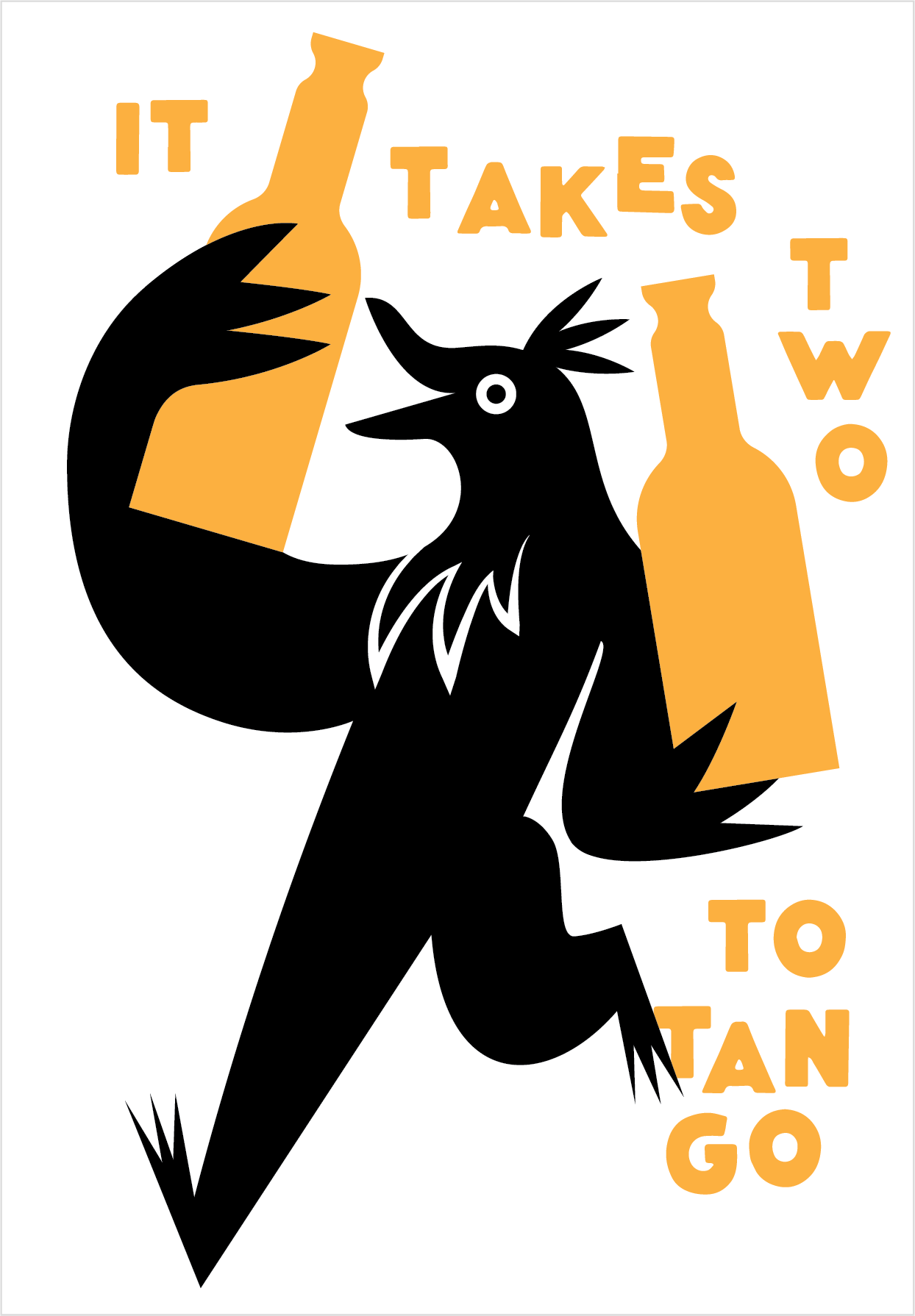
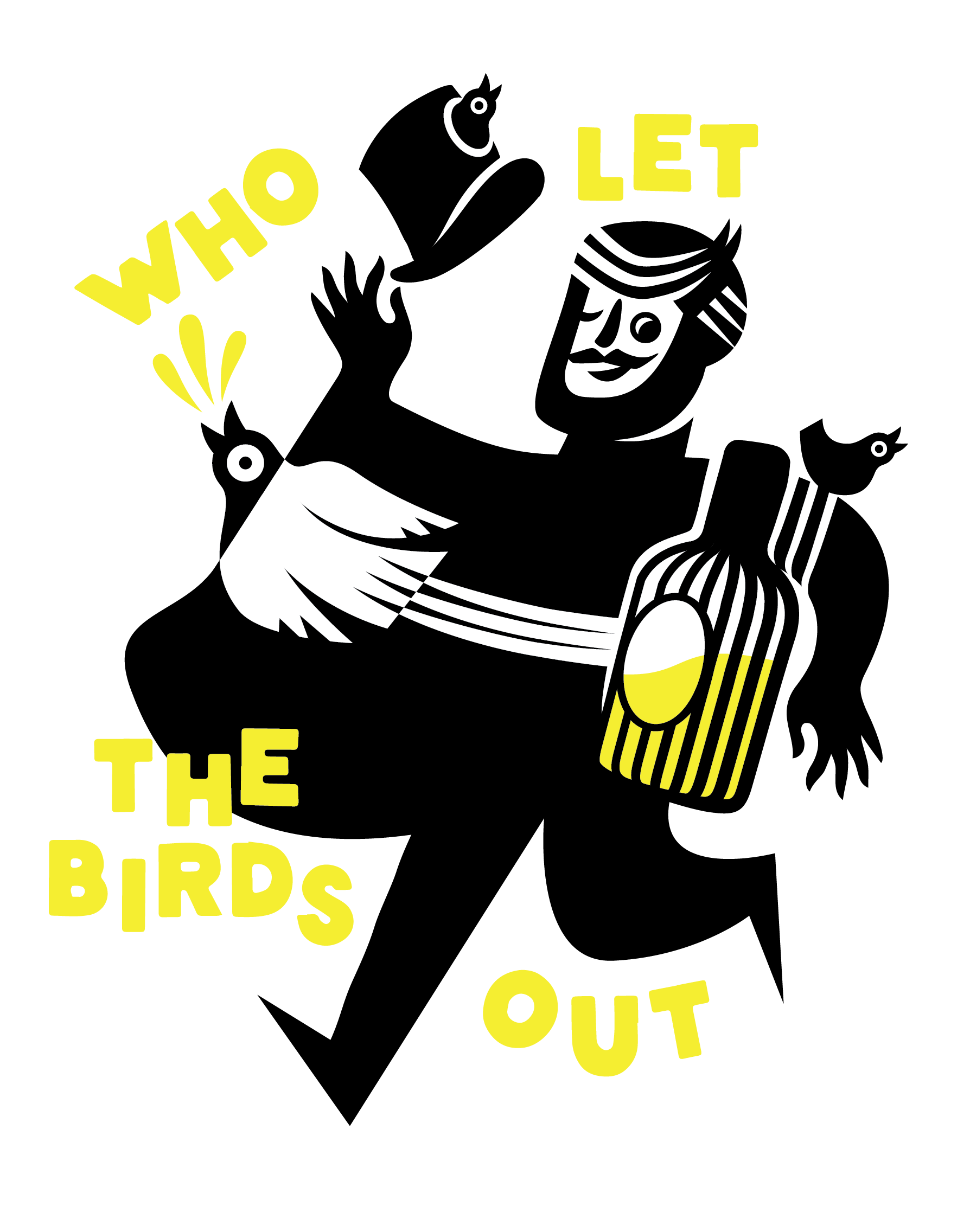
Additionally, I looked into colors and illustrations to explore what makes 'The Bird' unique in its expression.
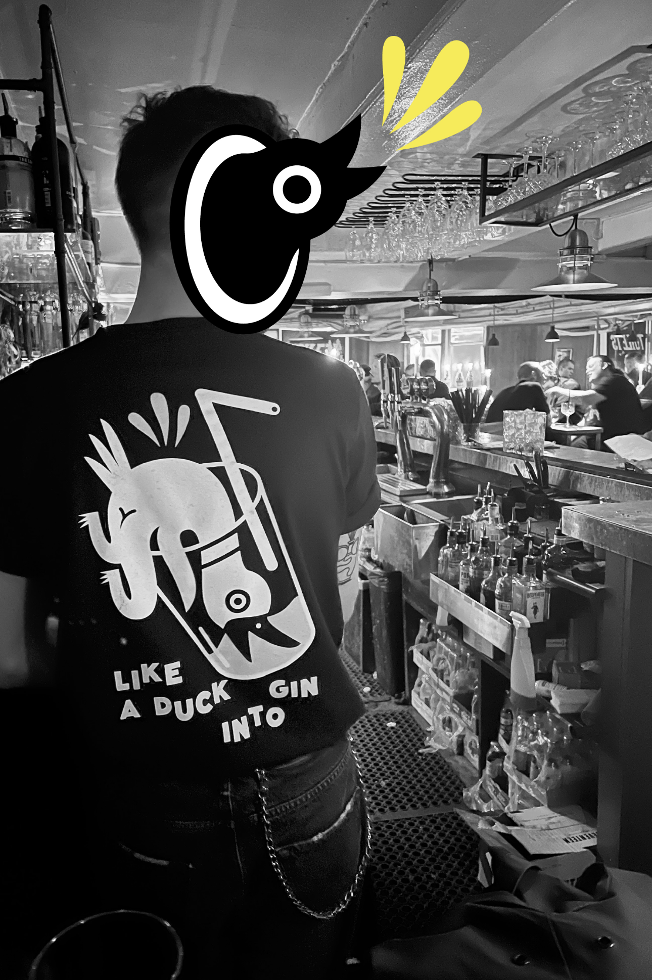
Illustrations were planned as responsive assets, meaning they could be adapted to fit various media types, including posters, social media posts, videos, or even murals.
